

Web Design: For Them, Not You
Remember the old days, when new advertisements on billboards were wallpapered right over the old ones? Some websites certainly feel like that. Have you ever gone searching for what should be a simple answer on a company’s website and spent frustrating minutes and clicks digging around for it?
Web design often seems more focused on appeasing internal stakeholders than anyone else. This is true even in home care. Many provider websites show the strain of trying to advertise every possible program or differentiator. Others seem to know how to add pages, but rarely take old ones away (does the public really need to see a slideshow of your 2017 fundraising gala anymore?).
Websites are the digital front door to your organization. If you want people to open the door, walk over the threshold and engage with you, you need to ensure you’re making it as easy as possible for them to find the doorknob and take that step. For some clients Transcend has worked with, this can mean rethinking their entire site.
We’ve developed a process for designing a website from the perspective of the most important stakeholders, usually potential patients and their families, and applying a set of best practices to ensure they can get what they need. Every organization will have slightly different needs, but we find that there are a few universal practices that save headaches for patients and families seeking information.

1. Start with the goal in mind.
If you don’t know why you want users to come to your site, why should they? Your organization should invest the needed time and effort into distilling down exactly why you want people to visit. This will help you work backwards from that goal and build something truly useful.
For example, let’s say your number one goal is for visitors to contact you. Knowing this or that goal will inform what information goes on the site and where it belongs. Adding multiple contact options helps those with different preferences feel comfortable reaching out, and ensuring your main contact methods are prominently displayed makes it easier for users to take action.
Put yourself in the mindset of a visitor. If you’re a hospice organization, people will be reaching out to you at a moment of crisis or distress. For instance, knowing this frame of mind can inform how you word your call-to-action. Instead of simply displaying your phone number, you may want to add a supportive phrase: “Struggling to find support? Call us now for help at XXX-XXX-XXXX.”

2. KISS is universal.
Keeping it simple will benefit your user experience. There will always be a few flashy websites out there, but having simple and straightforward navigation helps your visitors get to where they want to go and get what they need.
Remember that visitors won’t be familiar with industry terms or what you may call your special programs. The phrase “We Honor Veterans” means something to hospice providers, but a patient who has served in the Armed Forces may be confused by this or not even recognize it as a program. It helps to align the user with language they know and are familiar with, such as “Support for Veteran Patients.”
Simplicity is just as much about what you don’t prioritize. While many organizations are proud of their long history of community-focused care and their leadership team’s depth of expertise, taking up valuable navigation space with an “about us” section can be counterproductive to the main goal of the site. Most users aren’t there to research your history – they need help quickly.

3. Guide users, don’t make them hunt.
How often do you painstakingly read every word on a web page? Most consumers are looking for content that is skimmable and allows them to go deeper if they need or want to. It’s a good idea to “tier” your content with high-level brief overviews of a particular service available and links to deeper explanations for those that may need it.
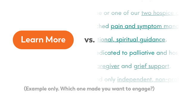
This also applies to how visuals subtly direct users around your site. Buttons are much easier to interpret than text-based links, and users have an existing frame of reference for them. Limiting options can also help – if you have 10+ bulleted links to more information, a user may feel overwhelmed and tune out.
Finally, think about grouping content based on visitor needs instead of any internal hierarchy you may have within your organization. To you, ordering pharmacy and durable medical equipment may be the responsibility of two totally different internal clinical departments, but to a patient or family, they may be closely grouped together as a service.
4. Pace the content.
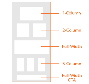
Reader fatigue is real. Nothing is more overwhelming than trying to read page after page of full-body text. Try using multiple columns, interspersing photos and other tools to add visual interest and keep the attention of your audience.
From a visual design perspective, changing column widths and section background colors can also help readers triage information and let them know where various portions begin and end. Additionally, building your visual language through consistent page elements, such as buttons or side navigation, will allow a user to understand intuitively how to navigate as they learn your site’s look and feel.

5. Consistency isn’t a bad thing.
Don’t feel the need to have every single page display a unique style, header image or layout. A consistent look and feel helps build the brand as well as user flow in the mind of your visitor. While every page doesn’t have to look and feel exactly the same, there’s something to be said for a standard style for most of your site.
This also applies to site navigation. Once you’ve established a particular experience or pathway for information, don’t make users relearn it or change it from one section to the next. Maintaining consistent navigation builds trust and familiarity. Keeping your language around calls-to-action (CTAs) consistent sets clear expectations for your visitors as well.
Using these principles will ultimately reduce friction for your visitors and allow you to start developing deeper relationships with them faster. Remember that a website is a living, breathing entity, and the best sites continually work to ensure consumers can access the information they need as quickly as possible, with minimal confusion.
If you’re thinking about rebooting your web presence but don’t know where to start, Transcend can help. We’ve supported dozens of home care companies through the process of thinking strategically about their websites. Our process is rooted in data and has helped many organizations increase community and self-referrals with the aid of a thoughtful approach that starts with the goal in mind. Reach out to us at hello@transcend-strategy.com to start a conversation around how we can help you reach your smart growth goals.
Related Posts
-
 January 18, 2021
 -
 October 12, 2020
 -
 September 17, 2019

